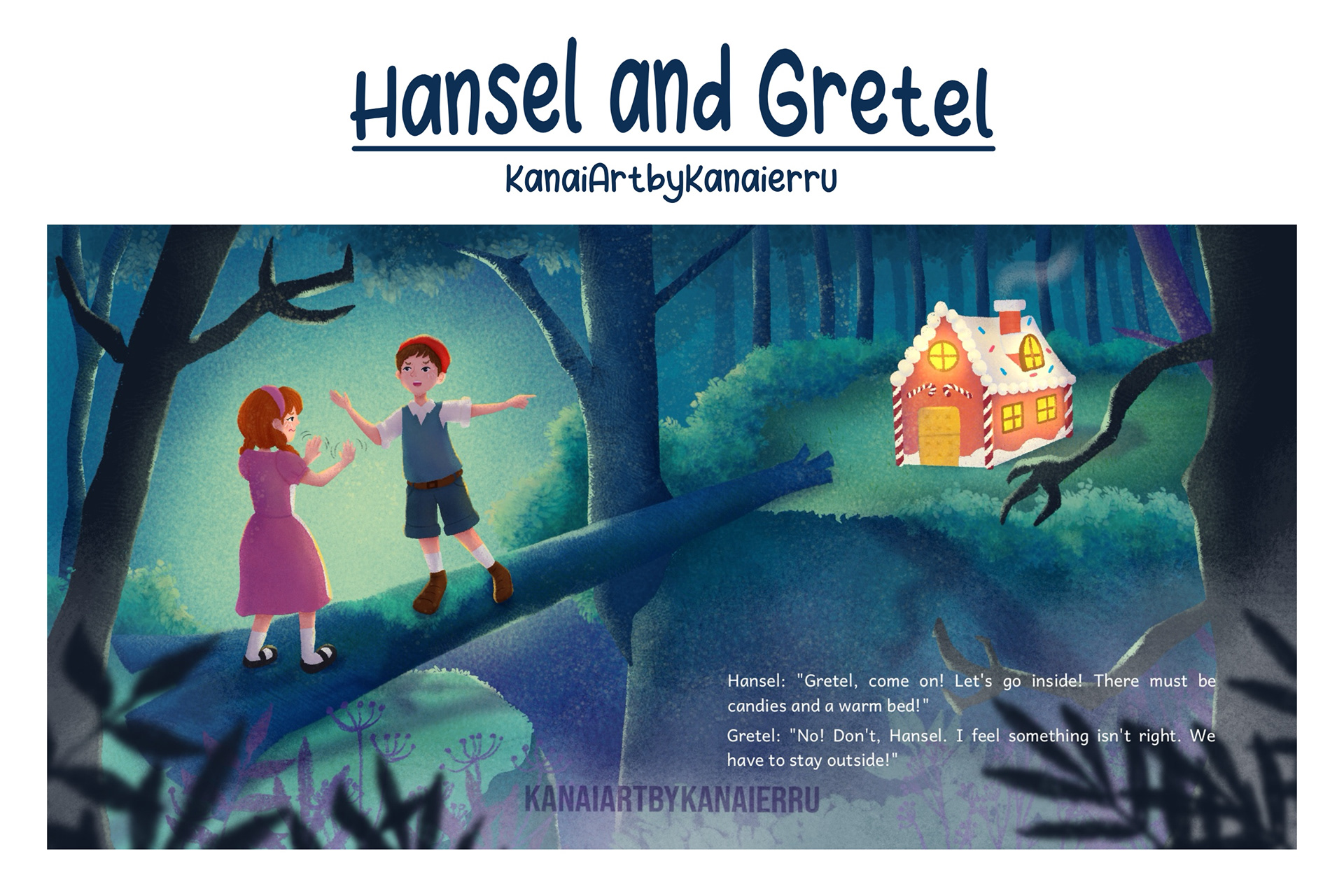
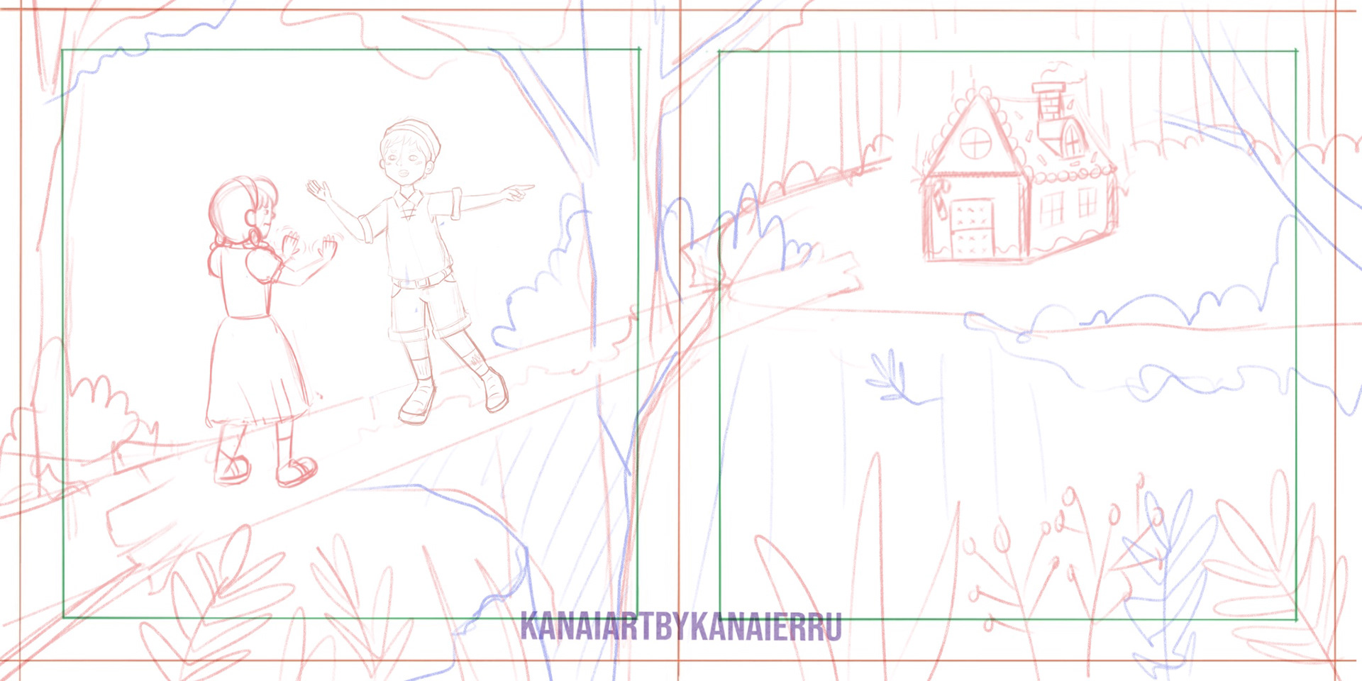
This illustration spread was designed for the classic tale of Hansel and Gretel, focusing on the critical moment where the children discover the Witch's gingerbread house. The primary challenge was to balance the tempting, bright fantasy of the candy house against the underlying tension and eerie mystery of the deep, dark forest.
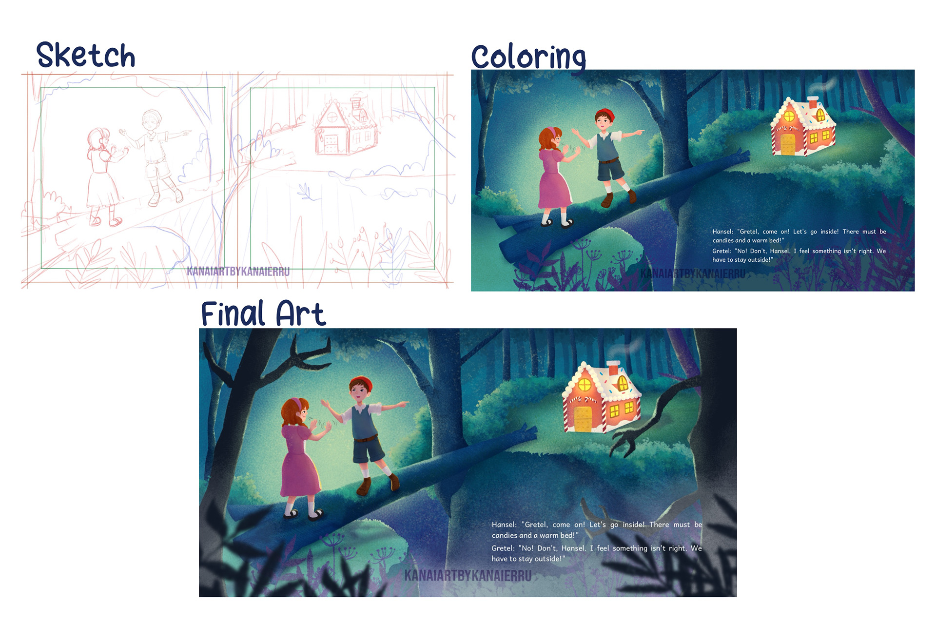
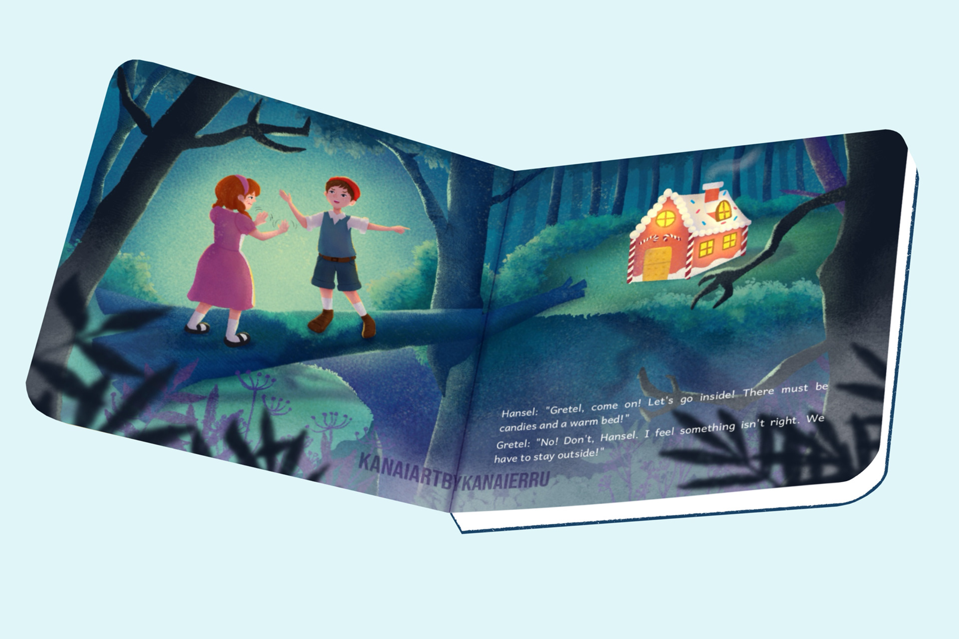
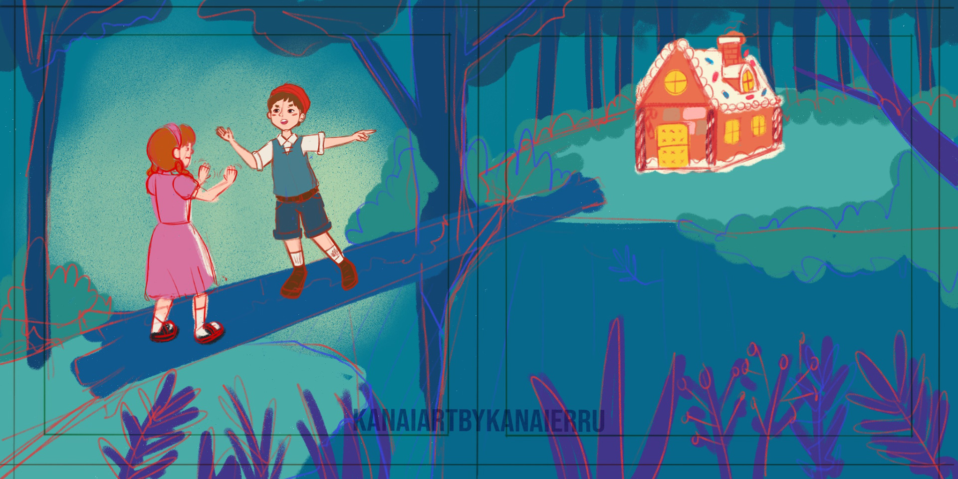
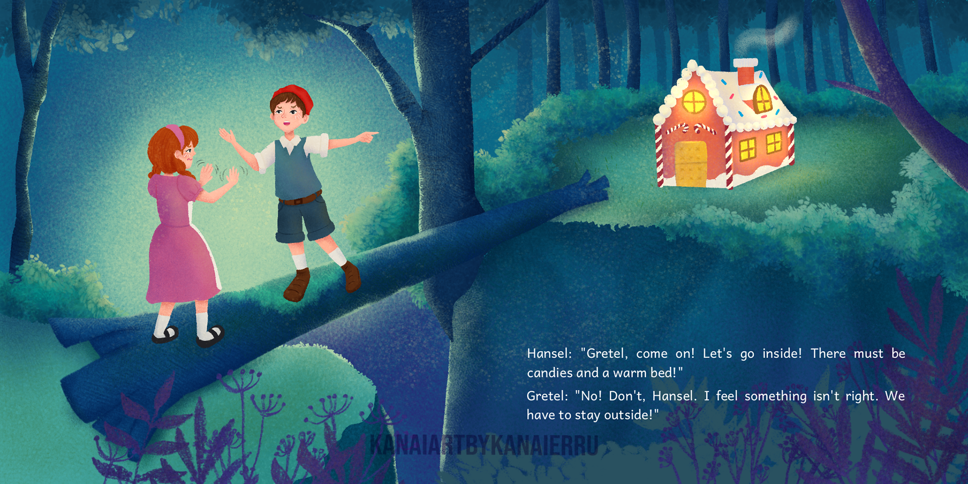
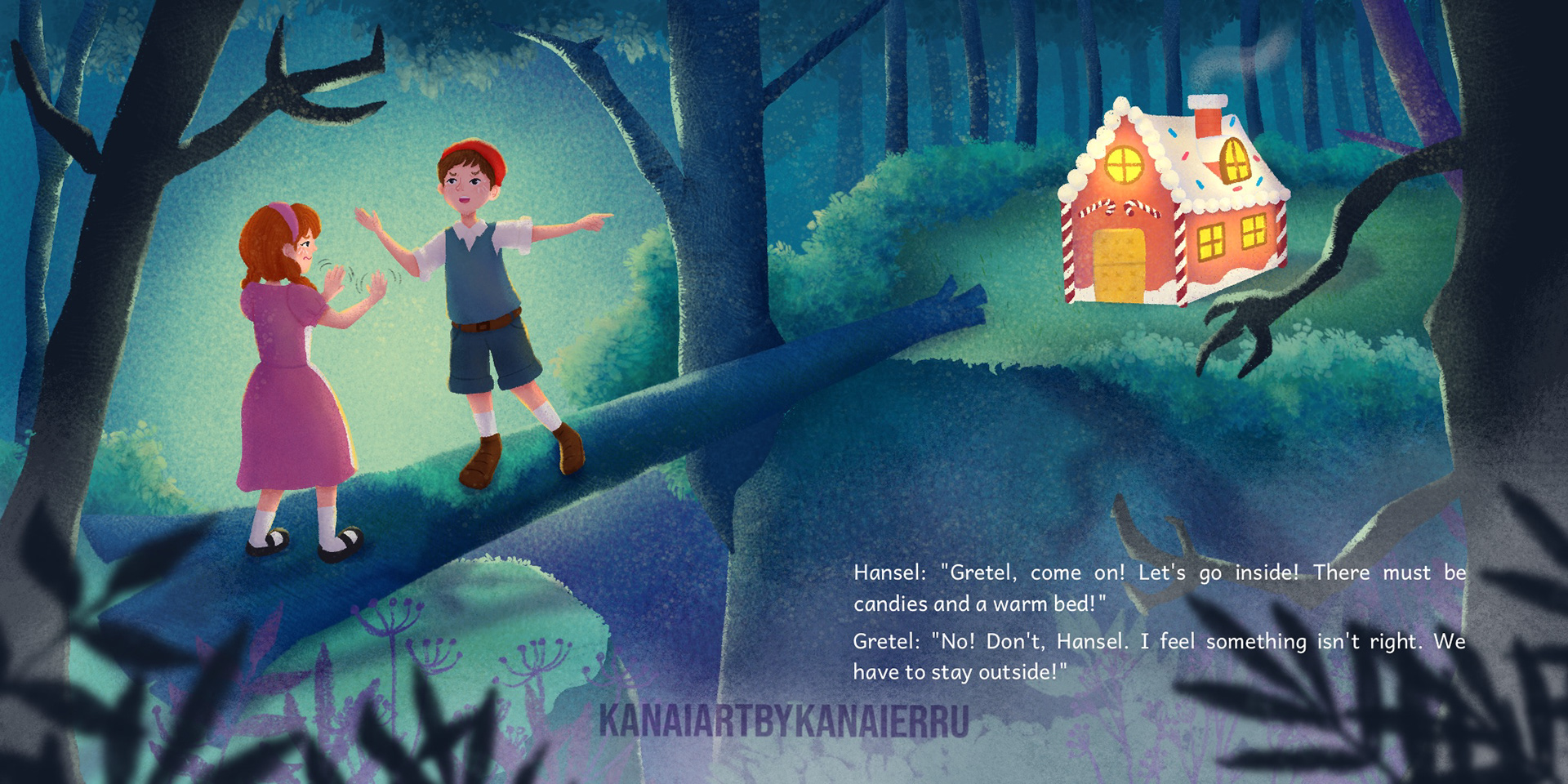
This piece demonstrates expertise in pushing stylistic boundaries, using color theory to evoke complex emotions (fear vs. temptation), and crafting impactful visual storytelling suitable for dark fantasy or mature children's books.